Watch dial aesthetics have gotten complicated with all the color options and finishing techniques flying around. As someone who has stared at countless dials across every price range, I learned everything there is to know about what makes certain dials captivating. Today, I will share it all with you.
We talk about movements and complications, but the dial is what you actually look at hundreds of times daily. The color, texture, and finishing of a watch dial communicate more about the piece’s character than most specifications. Understanding dial craft transforms how you evaluate and appreciate timepieces.
Color Psychology on Your Wrist
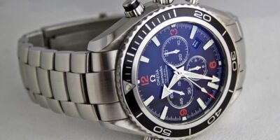
Black dials dominate tool watches because they maximize legibility. The contrast with white or metallic hands and indices creates optimal readability in variable lighting. Black reads as serious, professional, and versatile. It disappears appropriately, letting function dominate. Virtually every iconic tool watch defaults to black: Submariner, Speedmaster, Navitimer.
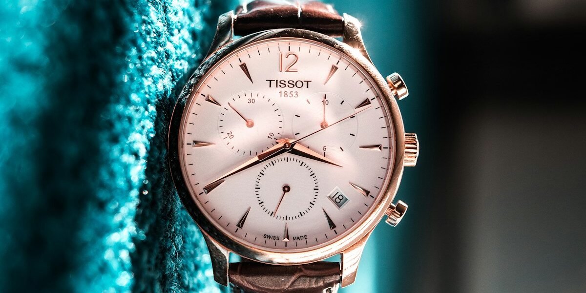
White dials signal dress watch territory, formal and traditional. They reflect more light, appearing larger and more prominent on the wrist. White dials demand cleaner design; any flaws or cheap printing become immediately apparent. A well-executed white dial with applied indices elevates perceived quality substantially.
Probably should have led with this section, honestly. Blue dials have dominated recent trends because they bridge categories. Navy blue works with suits while remaining contemporary enough for casual wear. Lighter blues add personality without becoming costume jewelry. The challenge with blue is photography: screens rarely capture the same hue you see in person.
Green has emerged as the enthusiast’s color choice, rare enough to signal insider knowledge while remaining wearable. British racing green on vintage-inspired pieces reads heritage. Bright mint or teal reads contemporary and bold. Green polarizes more than blue, you either love it or find it unwearable, which is precisely why enthusiasts gravitate toward it.
Texture and Finishing
Sunray brushing radiates fine lines from the dial center, creating dynamic light interaction as the wrist moves. It’s the most common dial finishing because it’s visually effective and relatively affordable to produce. Well-executed sunray brushing on a Seiko Presage competes visually with pieces costing five times more.
Guilloche describes engine-turned patterns created by specialized machinery. Waves, baskets, grain d’orge (barleycorn), and circular patterns create three-dimensional depth impossible to replicate with printing. Genuine guilloche uses rose engines or straight-line machines, each piece requiring individual attention. Mass production sometimes simulates guilloche with stamping, lacking the depth and precision of true engine-turning.
That’s what makes enamel dials endearing to us serious collectors—they represent the pinnacle of dial craft. Grand feu enamel involves firing glass powder at 800+ degrees Celsius onto a metal base, repeating the process multiple times to build depth and color. The resulting surface is glass, with depth and luminosity impossible to achieve with paint. Enamel dials survive centuries without fading, explaining their presence on museum-quality pieces.
Applied vs Printed Indices
Applied indices are three-dimensional components attached to the dial surface. They catch light, cast shadows, and create visual depth that printed numerals cannot match. The application process requires precision; misaligned indices immediately appear as quality failures. Applied indices signal manufacturer investment in finishing.
Printed indices lie flat on the dial surface. They’re less expensive to produce and perfectly functional for legibility purposes. High-quality printing can be attractive, but it inherently lacks the dimensionality of applied components. Affordable watches typically use printing; premium pieces typically apply.
What Your Choice Says
Black dial with applied steel indices: practical, serious, focused on function over flash. You prioritize tools that work over jewelry that decorates.
White dial with Roman numerals: traditional, formal, appreciating heritage over trend. You likely own more than one watch and select based on occasion.
Blue sunray with applied indices: contemporary but not flashy. You want something more interesting than black without veering into statement territory.
Green dial in any configuration: enthusiast signaling. You’ve thought about this more than casual watch wearers, and you want that visible.
Guilloche or enamel: connoisseur territory. You value craft and tradition over technical specifications, and your budget reflects it.
The Practical Takeaway
Buy the dial you’ll enjoy looking at for years. Specifications fade into background; the visual impression remains constant. A technically superior movement behind an uninspiring dial gets worn less than a modest movement behind something beautiful.
See watches in person before buying when possible. Photographs, especially manufacturer photographs, flatter subjects professionally. The dial that looks perfect online might disappoint in hand, while something you overlooked digitally might captivate physically.


Stay in the loop
Get the latest ichronos updates delivered to your inbox.